Installation view. For a detailed history of the 1916 Zoning Resolution click here.
IMPACT OF 1916 ZONING
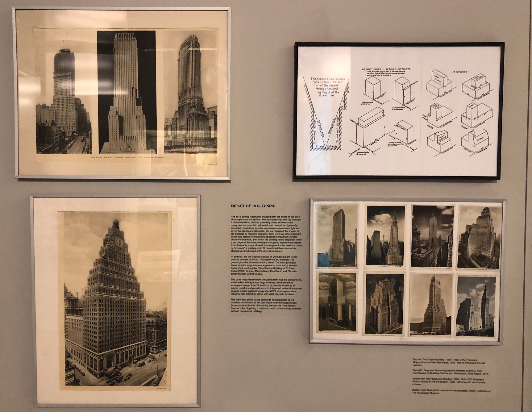
The 1916 Zoning Resolution changed both the shape of the city’s skyscrapers and the skyline. The zoning law had two key features. It divided land into districts according to “use” in three broad categories: commercial, residential, and unrestricted (generally industrial). In addition, in order to preserve a measure of light and air on the streets and sidewalks, the law regulated the shapes of tall buildings by requiring setbacks: there were five different “height” zones and setback formulas that specified a maximum vertical above the sidewalk, after which the building had to step back within a set diagonal. Because developers sought to exploit every square foot of rentable space allowed, this template for the maximum mass or “envelope” a building could fill determined the characteristic stepped-pyramid shape of the city’s skyscrapers.
In addition, the law allowed a tower of unlimited height to rise over 25 percent of the lot. The larger the lot, therefore, the greater possible dimensions for a tower. The most profitable tower form for large lots was a pyramidal base with a slender tower shaft, such as the Cities Service Building at 70 Pine Street (1932) in lower Manhattan or the Chanin and Chrysler buildings near Grand Central.
The other major determinant of building form was the standard of a well-lit office with light from large windows, which meant no workspace deeper than 28 feet from an outside widow to an interior corridor and elevator core. In this period and until advances in glass curtain wall technology after WWII, skyscrapers were masonry-clad in brick or stone, with inset, operable windows.
The many real-photo 1930s postcards of skyscrapers of era mounted in the frame at the right make clear the characteristic forms produced by the 1916 zoning law and the “form follows finance” rules of returning a maximum return on the money invested in these commercial buildings.

HUGH FERRISS, THE ZONING ENVELOPE
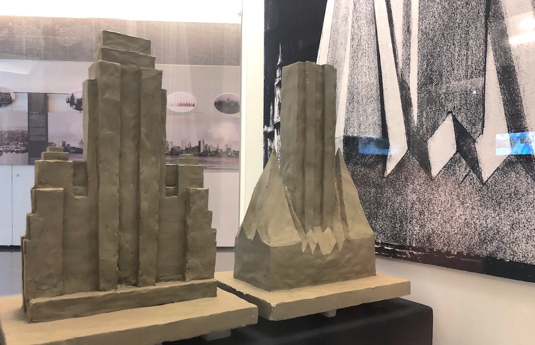
The architectural delineator Hugh Ferriss, working in collaboration with the architect and zoning advocate Harvey Wiley Corbett, created a series of drawings in 1922 called the “Four Stages of the Maximum Mass of the Zoning Envelope.” The First Stage is illustrated on a page in Ferriss’s 1929 book The Metropolis of Tomorrow, displayed here.
These drawings, which were widely exhibited and published, illustrate the step-by-step shaping of the maximum mass allowed by the zoning law into a profitable commercial structure. The first stage with sloping planes represented the angle of light required to preserve some sunlight on the streets and included a tower that filled the allowable one-quarter of the site. In the next stages, light courts were cut into the mass, and diagonal planes were squared off. The model, created by The Skyscraper Museum after Ferriss’s drawings, shows the final stage: an imposing structure with a central tower that would have been around 70 stories, flanked by 40-story stepped wings. The drawings made clear the benefits of a large site that would allow for a substantial tower with, in fact, no legal limit to its height.
The power and inchoate modernity of Ferriss's diagrams derived from their simple sculptural mass and monumentality. Many architects and planners in the 1920s cited their influence on skyscraper design and on their conception of the future city.
For a detailed, illustrated essay on the influence of the 1916 zoning law, see A 3D CBD: How the 1916 Zoning Law Shaped Manhattan's Central Business Districts"